

Love to know more about the neighbours? A new official website can now reveal how healthy your postcode is in comparison to the rest of England and Wales.
For the first time, UK researchers from the Centre for Environment and Health have come up with a detailed online map which shows the geographical pattern of various diseases across England and Wales.
The team, based at Imperial College London, also came up with companion maps of environmental factors such as air pollution, sunshine and pesticides.
By putting their postcode in online, users can zoom into the area in which they live to get an indication of the health risk for diseases such as lung and breast cancer, leukemia and heart disease relative to the average for England and Wales. The map allows you to zoom in as far as an area of about 6,000 people.
Although interesting and great for a bit of fun, researchers have warned not to assume a causal link between environment and disease just because the atlas may suggest it, as there are always a great variety of factors at play and a difference between association and causation. In other words, just because you’re surrounded by people with lifestyles that predispose them to heart disease, doesn’t mean you will be at risk if your lifestyle is healthy.
Although risk of skin cancer is greatest in southwest England according to the map, statistics actually show that it is the southeast of England which experiences the highest sunshine duration. This suggests other factors may be at play such as levels of exposure of each area and sun beds .
The team behind the map say it is intended to provide ‘baseline information for policy makers and the public on geographic patterns of environmental agents and disease’ as well as to help understand ‘disease risk that may relate to the environment, lifestyle factors and/or location.’
The healthiest areas according to the map are central London, North Norfolk, parts of Suffolk, Brighton and Hove.
The unhealthiest areas appear to be parts of Yorkshire, South Wales and the North West.
You can see the maps in full on the health atlas website, and find out how healthy your area is by selecting the disease you want to see the statistics for then entering your postcode.
We test some postcode health stats for ourselves:
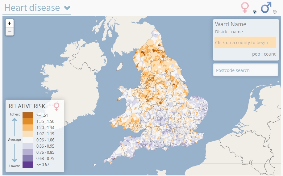
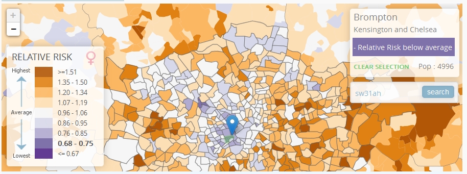
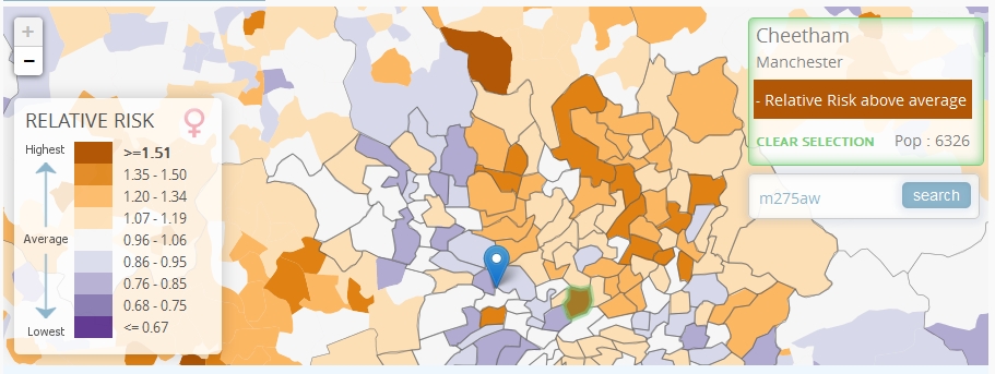
Heart disease:
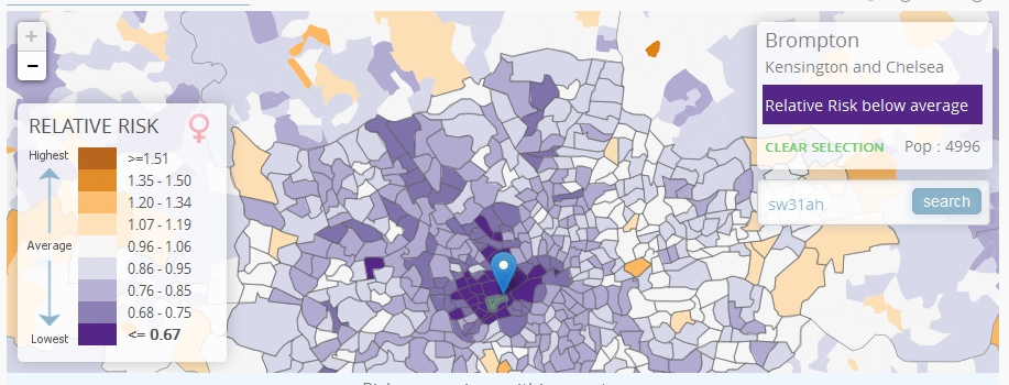
Brompton, Chelsea: Risk well below average
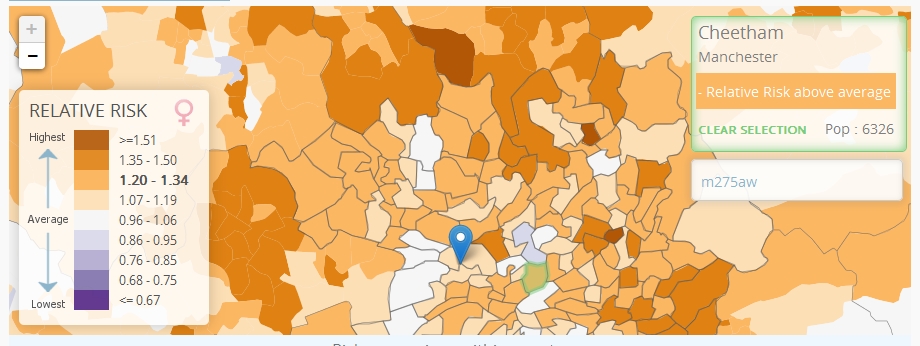
Cheetham, Manchester: Risk well above average
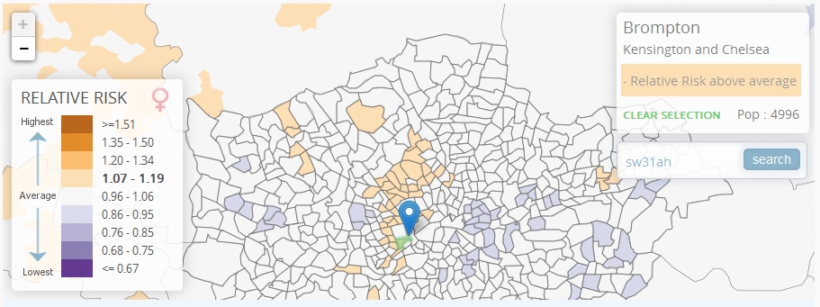
 Breast Cancer:
Brompton, Chelsea: Risk just above average
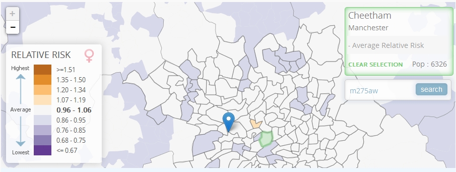
 Cheetham, Manchester: Risk average
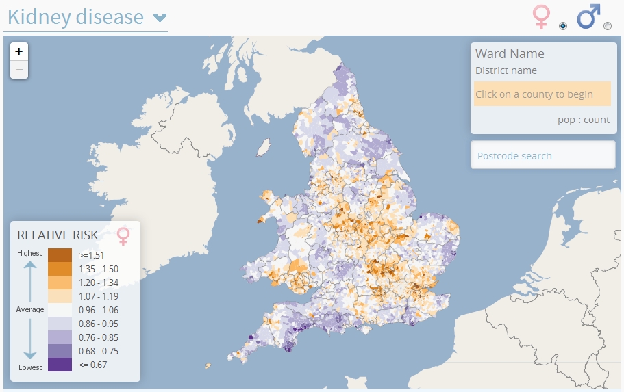
Kidney disease:
Brompton, Chelsea: Risk well below average
 Cheetham, Manchester: Risk well above average
Like this article? Sign up to our newsletter to get more articles like this delivered straight to your inbox.